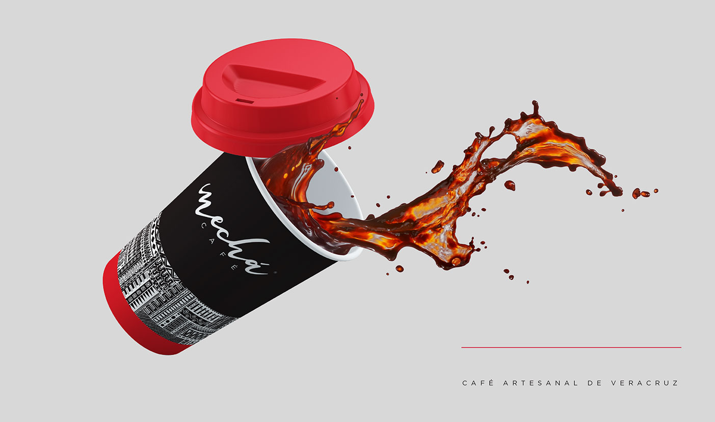
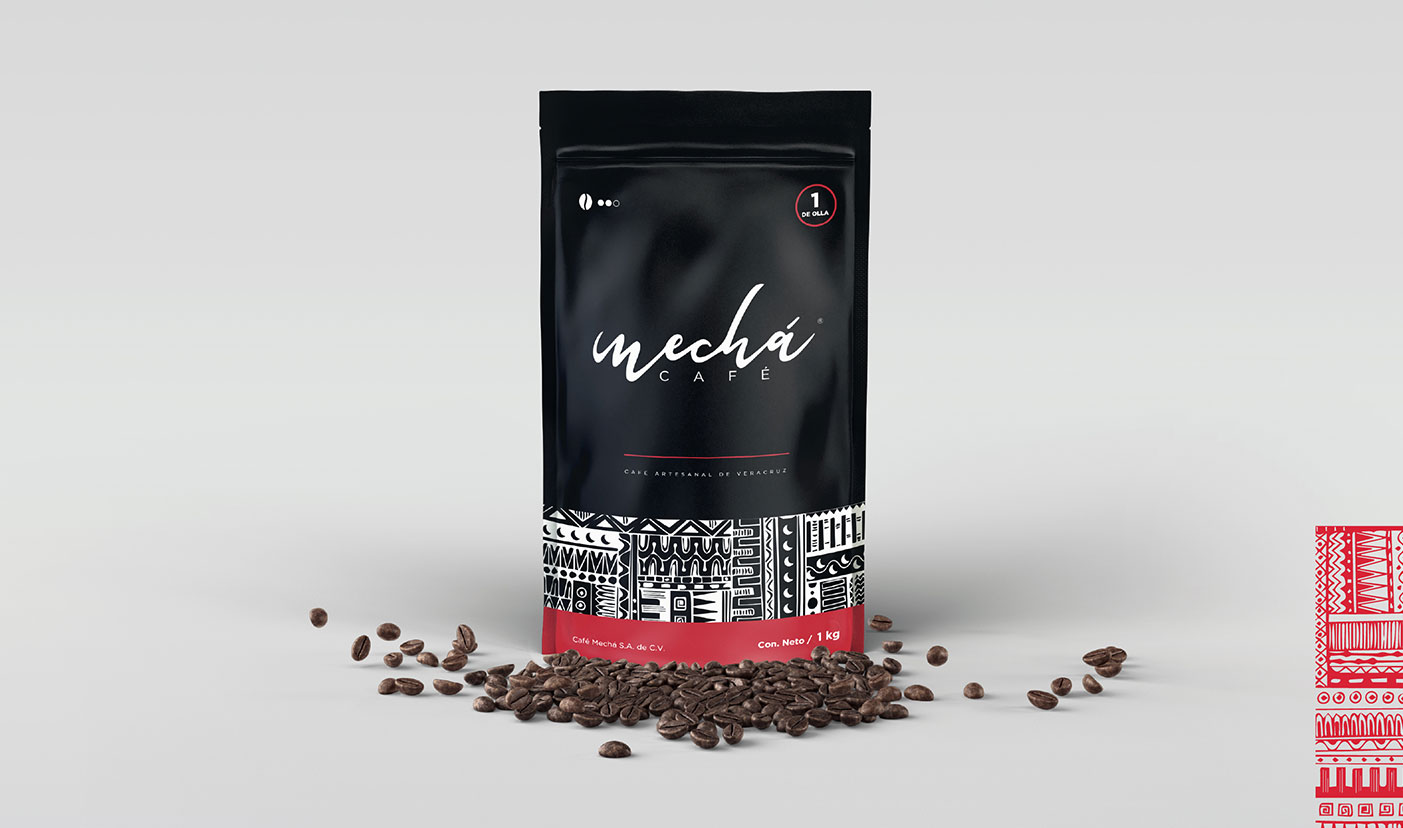
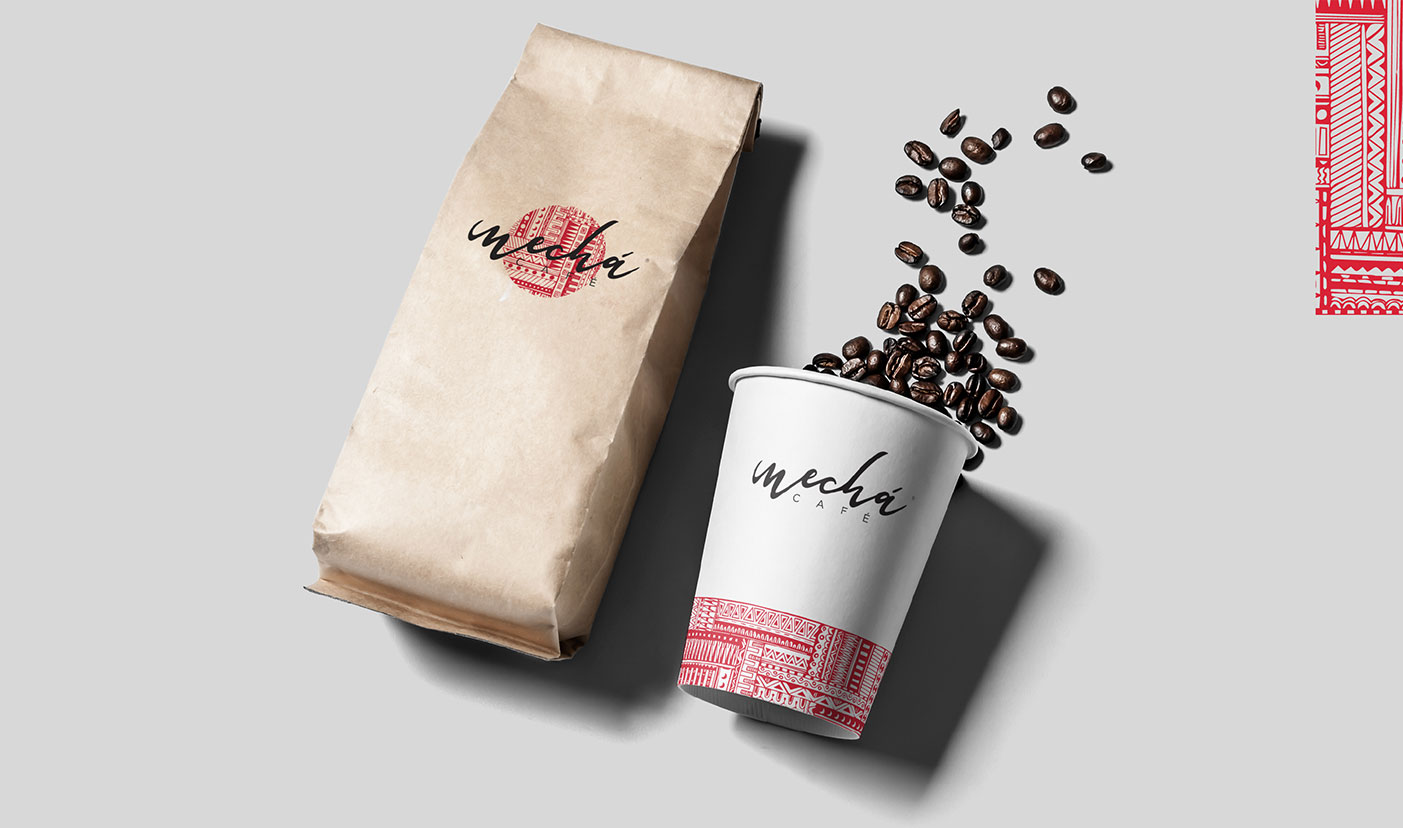
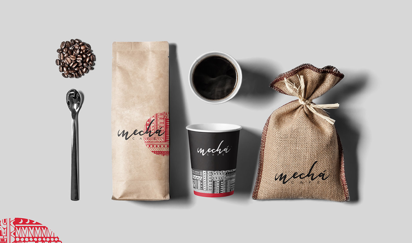
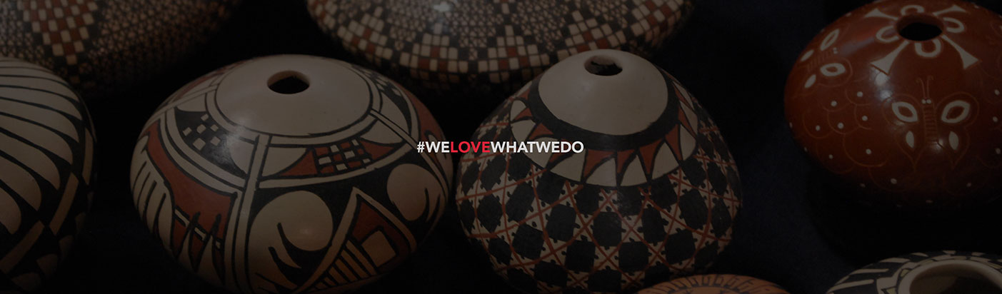
Our source of inspiration was Mata Ortiz ceramics since it is a very representative art of our region and it was intended to reflect some of our culture in the image of coffee. The logo is typographic and a typeface was created that give that feeling of being drawn with a brush that is one of the characteristics of the vessels: "that are hand painted".
The use of black and red was used because they are the most representative colors of these vessels. A pattern was created with graphic elements following the style of the art of the vessels to complement the graphic identity.
All together results in an image of a artisanal coffee of high quality but above all a regional product that can compete within the market.